Mobile Form UX Rules


Getting started with form UX... some logical rules I've researched and implemented here:
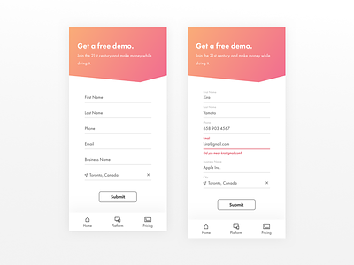
1. Bottom Nav bar - goodbye hamburger.
2. Field labels don't disappear, they transition above the text field to maintain context while typing.
3. Making life easy by using your current location to populate city - tapping x allows manual entry.
4. Real-time errors - don't wait for someone to submit the form unsuccessfully to tell them what they are missing or did incorrectly. + Bonus to suggest correct entry (probably only feasible for common email mistakes/typos).
Any suggestions?
Most research from:
https://uxplanet.org/mobile-form-usability-2279f672917d
Instagram @isabella.idlmr @idlmr


