Ok, so I hate hate hate Marker Felt, but for the first time felt it was appropriate. But then again, maybe Apple felt this same way when they made "Notes" for the iPhone.
eh, nothing wrong with marker felt, as long as it's used right :) Loving this UI though. Feels like I would actually grab the different elements.. very tactile.. nice work
Seriously dude. This looks top notch. Some of the best UI work I've seen in a while. The Marker Felt works, IMO. It actually works really well. I'm with ya on not being a fine generally as well, but here it is great.
One thing I was thinking about was the edge of the top box on the left page with the paper clip. It seems awfully close to the binding and it looks like you've done a good job with the shadow under card, but it looks like the paperclip just disappears underneath there. Maybe it's a bit too nitpicky but it was the first thing that drew my eye when pouring over the UI.
Excellent work! FWIW, the thing that first caught my eye was how the text didn't line up properly with the lines on the page. Just a bit of feedback for your discussion with your client.
19 Responses
Ok, so I hate hate hate Marker Felt, but for the first time felt it was appropriate. But then again, maybe Apple felt this same way when they made "Notes" for the iPhone.
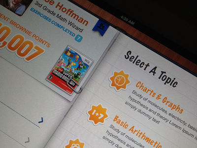
Check out the "Big-Book.png"
I will post on Twitter when this goes live.
over 1 year ago
I don't hate Marker Felt here. Oh, and the rest of it is badass too ;)
over 1 year ago
coOL :)
over 1 year ago
I think it fits perfect. Even that Chalkboard could work. It's all about its context. Love the look so far.
over 1 year ago
eh, nothing wrong with marker felt, as long as it's used right :) Loving this UI though. Feels like I would actually grab the different elements.. very tactile.. nice work
over 1 year ago
Dude, this looks hotty hot mchotterson.
over 1 year ago
So hawt. Marker Felt does seem to work here. I'm loving your execution of this style.
over 1 year ago
Gorgeous Interface. Love that Geometry badge
over 1 year ago
Wow. Excellent work, Eric.
The colours used on the text, the orange hues, all perfect.
over 1 year ago
So, why isn't the text horizontally lined up on the lines?
over 1 year ago
@Jonno,
Client and have gone back and forth on this. For now it's simply background. Still something we are thinking thru.
over 1 year ago
me like!
over 1 year ago
Gorgeous work, Eric. The fat paperclip goes along with the orange "stickers" really well. Good balance there.
over 1 year ago
WOOOO!
over 1 year ago
what an amazing detailing!
over 1 year ago
Seriously dude. This looks top notch. Some of the best UI work I've seen in a while. The Marker Felt works, IMO. It actually works really well. I'm with ya on not being a fine generally as well, but here it is great.
One thing I was thinking about was the edge of the top box on the left page with the paper clip. It seems awfully close to the binding and it looks like you've done a good job with the shadow under card, but it looks like the paperclip just disappears underneath there. Maybe it's a bit too nitpicky but it was the first thing that drew my eye when pouring over the UI.
over 1 year ago
This is just gorgeous man. Can't stop looking at it.
over 1 year ago
Excellent work! FWIW, the thing that first caught my eye was how the text didn't line up properly with the lines on the page. Just a bit of feedback for your discussion with your client.
over 1 year ago
Wow, thanks everyone! Appreciate all the support and feedback you guys provide! @Trevor, thanks for that, I will check on the clip.
@Michael, the lines are up for debate. Still trying to decide on that one.
over 1 year ago