I like the full view! I made a web app 2 years ago and this makes me kill to do another one. I agree with jeroen, the save button can use some color. Anyway, added to bucket!
@Jeroen@Robin its not pure gray its mix of gray/blue but i think you're right. Maybe i should try green/blue for 'save' and that gray/blue can be used for the selected state of dropdown. Thanks!
Lovely this. Very calming style applied to what could potentially be a stressful system to use. Great use of colour to delineate important info/actions.
14 Responses
Pro
zee7 ✽
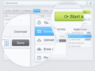
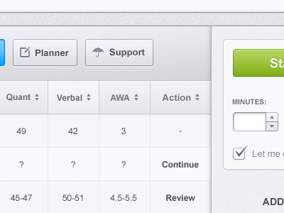
A few new additions in the 'test page'
Full view please
5 months ago
Pro
Dennis Covent
Nice!
5 months ago
Pro
Gadzhi Kharkharov
Good!
5 months ago
I just don't like the grey color of the "save" button. In my opinion save should have a different color because you're going to save a change.
The blue and green buttons look really clean. Very pleasing.
5 months ago
Pro
Mani
coOL coOL and COol :)
5 months ago
Pro
Robin Bastien
I like the full view! I made a web app 2 years ago and this makes me kill to do another one. I agree with jeroen, the save button can use some color. Anyway, added to bucket!
5 months ago
Pro
zee7 ✽
@Jeroen @Robin its not pure gray its mix of gray/blue but i think you're right. Maybe i should try green/blue for 'save' and that gray/blue can be used for the selected state of dropdown. Thanks!
Thank you all guys :)
5 months ago
Pro
Dan Malarkey
This looks good!
5 months ago
Pro
Alexandre Deschamps
Superb colors!
5 months ago
Pro
Richard Meredith
That looks polished zee, great work.
5 months ago
sexey
5 months ago
I knew that this is your work and without looking. Pleasant style.
5 months ago
Pro
Chris Sharp
Lovely this. Very calming style applied to what could potentially be a stressful system to use. Great use of colour to delineate important info/actions.
5 months ago
wow! i like
5 months ago