Pig Chef Logo V1-V3 Concepts

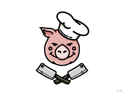
So... this logo is for our New Chef at my work. Kinda for a team crest! Awesome dude and get Chef and looking forward to the tasty food he will make! Anyways back to the logo, I made 3 comps but, 2 versions with different eyes. These are just concepts so I can't wait to see how this will evolve! Cheers!


