Logo-1

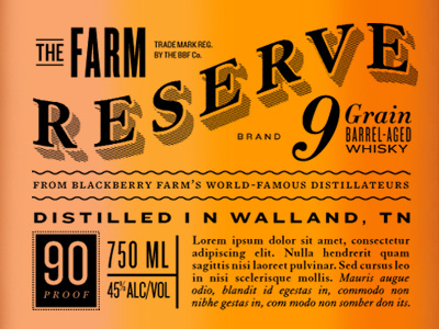
More Whisky concepts

9 Responses

  1. Pro Logo-1 Shed Labs

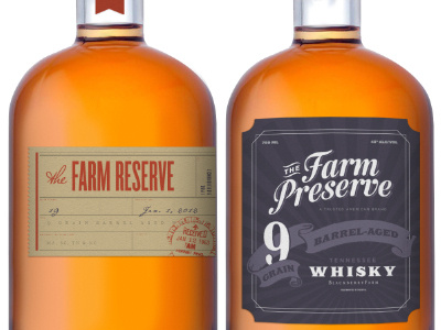
    and yes, whisky is spelled properly. I thought it looked kinda funny too, but it's a legit spelling. I'll share the sister beer labels later on. As always, spit your criticisms below — they are gladly accepted.

    likes

    5 months ago

  2. Pro Slater_small Nick Slater

    looks tasty! I have some whiskey at my office that is looking good right about now... but, not as good as this!

    5 months ago

  3. Avatar Jonas Hoffmann

    the first shot was a bit cluttered, but these look great. it's hard to compare these two, because they are very different in style. the left one looks classy and down to earth, the right not so serious and more fun (maybe leave out the 'sunrays' in the background).

    5 months ago

  4. Pro Drib-avatar Krista Engler

    These are both great. I'm partial to the one on the right. I would keep the rays, they're subtle but really help lead your eye to the "Tennessee Whisky" copy.

    5 months ago

  5. Dribbbleavatar Kady Jesko

    love this labeling, super nice

    5 months ago

  6. Header2 Matt Chase

    My personal preference is the original shot—really knocked the type out of the park in terms of sophistication & balance.

    5 months ago

  7. Pro Twitterhead Curtis McClain

    I would have to agree with Matt Chase. The original shot feels much more refined, distinctive and extremely well balanced.

    5 months ago

  8. Pro Logo-1 Shed Labs

    Thanks guys, I agree with both Matt and Curtis.

    5 months ago

  9. Pro Cemerson_2011_154 Chris Emerson

    Very nice - how was this artwork created?

    5 months ago

keyboard shortcuts: previous shot next shot L or F like