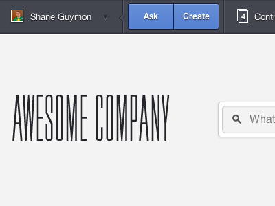
Dsc_0018

Responsivise This

5 Responses

  1. Pro Dsc_0018 Jayden Anderson

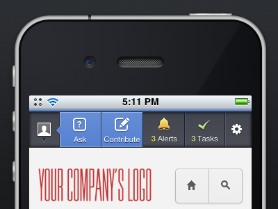
    This is my first responsive app design. Man, that sounded like a load of marketing jargon.
    Check out the high-res/full version.

    This wouldn't be what it is without Dan Rubin's kick-ass help. So many thanks to Dan.

    Feedback welcome as always.

    5 months ago

  2. Pro Avatar Adam Tolman

    Hot. Only comment would be about the global light. The blueish buttons up top have light hitting the top & left portions, and it looks like the rest of the 3D elements have the light coming from the top down. Super critical of me, but just wanted to share.

    Nice work, as always.

    likes

    5 months ago

  3. Pro For dr Eric Hoffman

    I think it looks great! I am wondering if the top is a little cramped for the touch area, but I can't truly say that until I hold this and tap. Now gimme!

    likes

    5 months ago

  4. Pro Curious me Anthony Lagoon

    I'd have to agree with Adam. But other than that, looks stellar!

    likes

    5 months ago

  5. Pro Dsc_0018 Jayden Anderson

    Thanks guys. Great feedback.

    @Adam and Anthony
    Yeah, The light is coming from top left on blue buttons. I originally planned on making them not feel so buttony, like this. Mid CSS change I decided against it. Great catch.

    @Eric
    Your hunch is right. The left and right dropdowns can be problematic. The four buttons in the middle feel like the size of a tab in a 5 tab UIToolbar. A little crammed, but still usable.

    5 months ago

keyboard shortcuts: previous shot next shot L or F like