Ew, global class clutter. I do my best to avoid globally-defined stuff like that, so the style definitions are contextual to the page instead of dependent upon extra markup in the view. But we also operate in large Rails apps most of the time, so clean views are always a priority; YMMV.
@Cameron: "Ew, global class clutter"
also known as "visual framework" - it really depends on how you look at it- and I'm guessing you would use this technique frugally, only on high-impact typography.
1. Yeah. Sigh. It’s tough to be a perfectionist when the end result is left to an unpredictable set of browsers. Designing for the web means either giving up a lot of the perfection that print design allows or finding a workaround. But you know this. Nice to see you’re not giving up.
2. Never mind.
3. Ah. Looked accidental. A matter of opinion. In context it’ll probably make more sense. Looking forward to seeing it in real-deal HTML/CSS.
Related to what a few other people have said, have you tried Kerning.js combined with Lettering.js? A nice combo, though a bit heavy for presentational perfection.
20 Responses
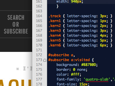
Yes, I use multiple classes on the same words sometimes.
over 1 year ago
Ever try the Twilight theme?
over 1 year ago
@Darren Does it sparkle?
over 1 year ago
I love this idea.
over 1 year ago
Ew, global class clutter. I do my best to avoid globally-defined stuff like that, so the style definitions are contextual to the page instead of dependent upon extra markup in the view. But we also operate in large Rails apps most of the time, so clean views are always a priority; YMMV.
over 1 year ago
Also, you mad.
over 1 year ago
@Matt I followed you just for that comment.
over 1 year ago
Good idea Josh. Way to be in the details!
over 1 year ago
AHAH, no worries man, maybe of us do the same :)
over 1 year ago
ok im a coda man - what editor is that one you have there and what "theme".
over 1 year ago
nevermind - i think i see it's textmate :( shame shame
over 1 year ago
textmate blasts coda into space. all props for your choice of editor, Josh
over 1 year ago
Isn’t this what lettering.js was made for? http://letteringjs.com
over 1 year ago
@Cameron: "Ew, global class clutter"
also known as "visual framework" - it really depends on how you look at it- and I'm guessing you would use this technique frugally, only on high-impact typography.
over 1 year ago
That kind of stuff is usually fixed with
text-rendering: optimizeLegibility;ALSO. Negative/positive margin +
display: inline-block;would probably be better for one’s mental model, but to each his or her own.ALSO, while you’re at it, that OR needs some kerning love.
over 1 year ago
Mike:
1) Usually, but not always. Usually isn’t enough.
2) I don’t know what that means.
3) It has it. In the context of the rest of the nav, all the middle lines are intentionally tracked wide.
over 1 year ago
@Andy all true.
over 1 year ago
1. Yeah. Sigh. It’s tough to be a perfectionist when the end result is left to an unpredictable set of browsers. Designing for the web means either giving up a lot of the perfection that print design allows or finding a workaround. But you know this. Nice to see you’re not giving up.
2. Never mind.
3. Ah. Looked accidental. A matter of opinion. In context it’ll probably make more sense. Looking forward to seeing it in real-deal HTML/CSS.
Related to what a few other people have said, have you tried Kerning.js combined with Lettering.js? A nice combo, though a bit heavy for presentational perfection.
over 1 year ago
I know what that's like! — messed with class-laden manual kerning for some web specimens a while back.
Why isnt that first one .track3? :)
over 1 year ago
It's good to see a healthy obsession with text perfection! Absolutely beautiful.
over 1 year ago