Pure Pleasure Design Logo 2012

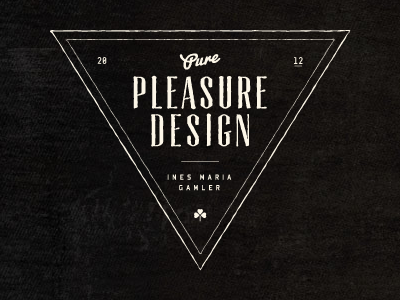
Some of you may have heard about my upcoming relaunch. Yay! Currently I'm working hard on getting things done and setting up my new blog and portfolio website. At this point, there's not that much to see, but I'm glad to share my attempt on a new logo with you.
The new design will be more emotional & texturized, a bit nostalgic, responsive, less complex, with a strong focus on good typography and edgy when it comes to CSS3 & HTML5 features.
There's still a lot of work ahead, but I'd love to hear what you think about the new logo and style so far :D


