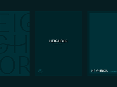
Neighbor Stationery
Considering showing a little restraint from what I posted yesterday. I think I sometimes convince myself that everything needs to have elaborate patterns or assets when sometimes its better to just let the identity stand on its own with a beautiful color palette, relying on simplicity throughout the identity. As an added bonus, it makes the brand easier to execute consistently upon handoff too.
More by Andrew Littmann View profile
Like


