Find designers
Designer search
Quickly find your next designer
Post a job
The #1 job board for design talent
Inspiration
Courses
UX Diploma
Learn UX design from scratch in 6 months
UI Certificate
12-week UI skill building for designers
Live interactive workshops
with design professionals
Jobs
Go Pro
Log in
Dribbble: the community for graphic design
Advance your career with a Professional Diploma in UX Design
Learn more
Log in
Sign up
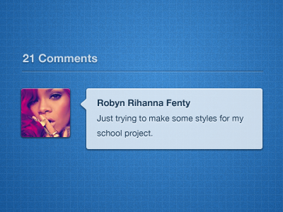
Comment bubble
Robert van Klinken
Follow
Following
Like
#296DAF
#347DC2
#CDDEED
#793F73
#C6ADAA
Download color palette
Trying out a few comment styles for the school project.
blue
bubble
comment
simple
style
ui
View all tags
Posted on Jan 4, 2012
6,155
13
166
5
View feedback
Robert van Klinken
More by Robert van Klinken
View profile
Previous
Next
Loading…