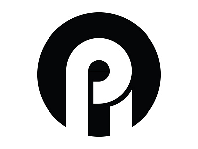
Insignia Concept #2

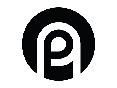
This is the next iteration on the concept of creating a simple insignia around my initials "PA".
I continued to explore the simple rounded shapes from both "p" and "a" letterforms and how they can interact and intersect. This time I wanted the letterforms to be more distinct and separate from each other.
Here I superimposed the "p" over an uppercase "A" — in the hopes that even though it is smaller in scale that it would be the primary visual focal point. I curved the crossbar on the "A" to conform to the bowl of the "p", as well as kept uniform line thickness to keep the entire element unified.
I don't love this. It's nice, but I still feel the first concept was much more simple and elegant. But I'm not done. Not by a long shot. More iterations to come!