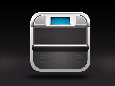
App Icon for a game app - getting there
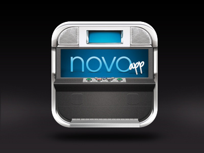

Hey guys, still not final but on the way there... some reflexions are not at the point yet and some shadows are missing. I´m a little bit worried that the whole thing looks too much like a jukebox (actually its a modern gambling machine). Also I´m not sure about the typo. And the whole monitor should probably be darker... what do you think? Here´s the bigger version http://dribbble.com/shots/369572-Bbb2012-01-02/attachments/18966