Find designers
Designer search
Quickly find your next designer
Post a job
The #1 job board for design talent
Inspiration
Courses
UX Diploma
Learn UX design from scratch in 6 months
UI Certificate
12-week UI skill building for designers
Live interactive workshops
with design professionals
Jobs
Go Pro
Log in
Dribbble: the community for graphic design
Log in
Sign up
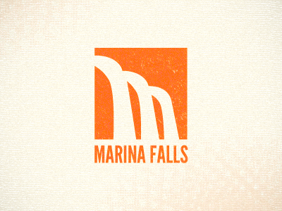
Marina Falls Logo
Joshua Hibbert
Follow
Following
Like
#FBF6E7
#FF731E
#FBD5AF
#FF882F
#FEA55F
Download color palette
Is the logo obvious enough?
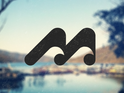
Rebound of
Marina Bay Logo
By
Joshua Hibbert
design
league gothic
logo
negative space
orange
texture
water
waterfall
View all tags
Posted on Jan 2, 2012
1,657
5
33
6
View feedback
Joshua Hibbert
More by Joshua Hibbert
View profile
Previous
Next
Loading…