Personal Logomark

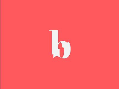
My updated personal logo, part of my new brand identity!
The new identity consists of a new logo, stationery, pattern, visual system, graphics and updated portfolio website.
The logo is Didone-style B sliced and “stretched” in two sides, but still connected, to represent my overall style of class and elegance with an artistic & creative influence. My work is described as elegant, classy, artistic, and often experimental, the mark’s use of sharp lines and curves that remain connected brings these ideas together. The two sides also represent graphic design and digital art, my two areas of focus.


