@Simon @Mauricio @Jake @Aaron @David & @Matt - Thanks for the comments and the great feedback so far, guys!
Currently debating myself wether or not I should redo the site in b/w for 2012. I told myself "minor updates", but that never happens once you get started, you know ;)
Nothing I love more than working on a palette of choice, but b/w feels right somehow. What you guys think?
Black white sounds good and will def fit the direction it looks like your heading. And if black and white gets boring you could always try grayscale. Love it.
@Carlos @Matt @Brian @Richard @Jarno @Fabio @Noptar @Tom & @Muhammad - Thank you guys so much for all the comments and ideas. I've decided to roll with b/w... for now ;)
Haha, looking forward to your 'minor changes'! I really like the look of this, especially the left side. As I've said about a billion times before, your colour palettes are always stunning but I'm all for a b&w website - can't wait to see what you come up with!
32 Responses (page 1 of 2)
Pro
Emir Ayouni | Growcase
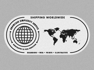
Just working on some updates for the Growcase website for 2012.
5 months ago
Pro
Simon Ålander
Oh yeah!
5 months ago
Pro
Mauricio Cremer
dope!
5 months ago
Pro
Jake Dugard
I love this. I think you could simplify the map though. But very cool.
5 months ago
Pro
Aaron Scamihorn | RONLEWHORN
This feels like 1950's sexy news-reel stuff. Love it!
5 months ago
Looks great.. maybe some pixel hinting on the globe to really make it sharp, otherwise looks awesome.
5 months ago
Pro
matt hochleitner
What Aaron said!
5 months ago
Pro
Emir Ayouni | Growcase
@Simon @Mauricio @Jake @Aaron @David & @Matt - Thanks for the comments and the great feedback so far, guys!
Currently debating myself wether or not I should redo the site in b/w for 2012. I told myself "minor updates", but that never happens once you get started, you know ;)
Nothing I love more than working on a palette of choice, but b/w feels right somehow. What you guys think?
5 months ago
Pro
Birgit Zimmermann
that looks really great!
5 months ago
Pro
Patrick Branigan
This rocks! Nice Emir!
5 months ago
Pro
Emir Ayouni | Growcase
@Birgit & @Patrick - Thanks guys. Much obliged!
5 months ago
Pro
Gert van Duinen
Oh I thought it was you ;)
Really nice work bro!
5 months ago
Pro
Mike Jones
Radness!!
5 months ago
Pro
Emir Ayouni | Growcase
@Gert & @Mike - Cheers homies!
5 months ago
Pro
Carlos Fernandez
Nice! I like where you're going with it Emir! Looking forward to seeing the rest.
5 months ago
Pro
Matt Lawson
excellent!
5 months ago
Pro
Brian Plemons
I like it. I also like the b/w idea as well. Maybe more so because I'm working on some big changes to my site right now and everything is b/w :)
5 months ago
Pro
Richard Lowery Jr.
Black white sounds good and will def fit the direction it looks like your heading. And if black and white gets boring you could always try grayscale. Love it.
5 months ago
Pro
Jarno Fabritius
Good stuff here, your site is awesome already!
5 months ago
I'm all for the b/w feel!
5 months ago
Pro
Mani
brilliant :)
5 months ago
Quality. Nice work Emir!
5 months ago
Pro
Muhammad El Melegy
Great work man!
5 months ago
Pro
Emir Ayouni | Growcase
@Carlos @Matt @Brian @Richard @Jarno @Fabio @Noptar @Tom & @Muhammad - Thank you guys so much for all the comments and ideas. I've decided to roll with b/w... for now ;)
5 months ago
Pro
Claire Coullon
Haha, looking forward to your 'minor changes'! I really like the look of this, especially the left side. As I've said about a billion times before, your colour palettes are always stunning but I'm all for a b&w website - can't wait to see what you come up with!
5 months ago