Vancouver Canucks Concept 1

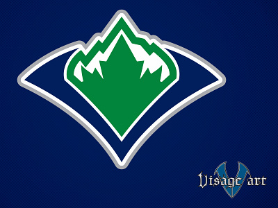
The Vancouver Canucks are my favorite sports franchise. The Primary logo they have used for the last 20 years is something that locally has been polarizing, some people love it, others not so much. I decided to make something that is simple but i think speaks to the geography and the Canucks name. The V is at the bottom centre and opens to a mountain where in the ice capped peaks have a maple leaf in the negative space.


