I think it's not clear in which state it is at. Or is it? One can think it is "hidden" right now (as it is pushed), but "visible" is all the way more… well: visible, right now. I think it can be confusing.
You can maybe choose one of the two metaphors you're using there: pushed and/or lit.
Lucas, you are right! I've seen this button so many times that I took for granted how it works. In my brain, "visible" is active because it's "turned on and in white", and "hidden" is inactive because "it's grayed out and not switched", if you know what I mean.
Might need to re-think about this… I'm not a big fan of switchers on the web anyway, the metaphor works great in the iPhone, but you can't "toggle" something with your finger on the web… yet.
I still think the problem is that you have two metaphors, and they're saying opposite things. I've made this minor change, which I think maintains your design, while at the same time spelling the same message with both your metaphors (pushed and turned on). What ya think? Code: http://jsfiddle.net/rwF8j/15/
Yes Rodrigo, you're right. I didn't noticed when I did it, but in my rebound there's no way that you can figure out what the button does until you press it, so like you say, it's confusing.
9 Responses
Pro
Rodrigo Galindez
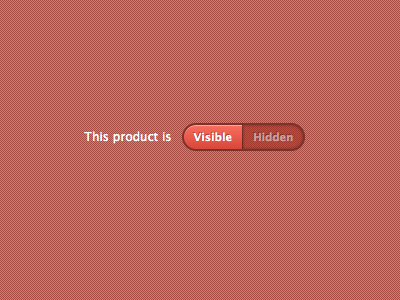
Trying to make a minimal switcher. Still not there yet. No images, just CSS3. Code: http://jsfiddle.net/rwF8j/5/
5 months ago
I think it's not clear in which state it is at. Or is it? One can think it is "hidden" right now (as it is pushed), but "visible" is all the way more… well: visible, right now. I think it can be confusing.
You can maybe choose one of the two metaphors you're using there: pushed and/or lit.
5 months ago
I'm sorry, I forgot:
It is gorgeous! as usual! :)
5 months ago
Pro
Alexandre Deschamps
Lookin' good :)
5 months ago
Pro
Rodrigo Galindez
Lucas, you are right! I've seen this button so many times that I took for granted how it works. In my brain, "visible" is active because it's "turned on and in white", and "hidden" is inactive because "it's grayed out and not switched", if you know what I mean.
Might need to re-think about this… I'm not a big fan of switchers on the web anyway, the metaphor works great in the iPhone, but you can't "toggle" something with your finger on the web… yet.
5 months ago
Rebound
Switcher button
by Juan Ignacio Serra
You can adapt the concept of the switch to a button that changes its content when pressed.
5 months ago
Pro
Rodrigo Galindez
Juan, I really like the solution in terms of style (looks simpler!), but it's still confusing to me.
5 months ago
Rebound
Switcher - minor change
by Lucas Mourelle
I still think the problem is that you have two metaphors, and they're saying opposite things. I've made this minor change, which I think maintains your design, while at the same time spelling the same message with both your metaphors (pushed and turned on). What ya think? Code: http://jsfiddle.net/rwF8j/15/
5 months ago
Yes Rodrigo, you're right. I didn't noticed when I did it, but in my rebound there's no way that you can figure out what the button does until you press it, so like you say, it's confusing.
5 months ago