Really nice looking. I love that control at the top for the languages- it looks like it accomplishes selecting the 'to' and 'from' languages as well as toggling the direction? Very clever.
I think the search button will be the most used control since search is the most common use case for the app. In search mode, it won't matter which way the flipper is switched to (which I'll post later).
You do make a good point, though. For those who primarily browse, they may be switching quite a bit. I think the top center is is still a pretty easy target for the thumb. Maybe I'm wrong though.
6 Responses
First pass on the Languages visual theme. I'll post more soon. Let me know what you think - I'm all ears!
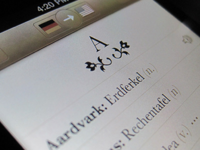
I should also mention that Languages is an offline translation dictionary that Tapity is designing and Sonico (iTranslate) is developing.
over 1 year ago
Pro
Bill Labus
Really nice looking. I love that control at the top for the languages- it looks like it accomplishes selecting the 'to' and 'from' languages as well as toggling the direction? Very clever.
over 1 year ago
Pro
Matthias Mentasti
this is the sexiest translation tool I've seen so far.
can't wait to see more or to buy it
over 1 year ago
Thanks Matthias. Just you wait, it's going to be da bomb.
over 1 year ago
Pro
Robin Raszka
I'd consider having the switcher (most used control, no?) at the bottom because it's much more friendly for your thumb.
over 1 year ago
I think the search button will be the most used control since search is the most common use case for the app. In search mode, it won't matter which way the flipper is switched to (which I'll post later).
You do make a good point, though. For those who primarily browse, they may be switching quite a bit. I think the top center is is still a pretty easy target for the thumb. Maybe I'm wrong though.
over 1 year ago