Find designers
Designer search
Quickly find your next designer
Post a job
The #1 job board for design talent
Inspiration
Courses
UX Diploma
Learn UX design from scratch in 6 months
UI Certificate
12-week UI skill building for designers
Live interactive workshops
with design professionals
Jobs
Go Pro
Log in
Dribbble: the community for graphic design
Advance your career with a Professional Diploma in UX Design
Learn more
Log in
Sign up
Portfolio
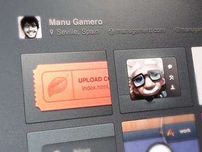
Manu Gamero
Follow
Following
Like
#7C8288
#676669
#F2C9B3
#363035
#E49276
#A96E69
Download color palette
Definitely redesigning my portfolio, but you never know...
Inspired by the fabulous Dribbble UI.
17:00
dribbble
interface
manu
portfolio
screenshot
shadow
texture
ui
ux
View all tags
Posted on Dec 19, 2011
12,216
37
363
17
View feedback
Manu Gamero
More by Manu Gamero
View profile
Previous
Next
Loading…