Find designers
Designer search
Quickly find your next designer
Post a job
The #1 job board for design talent
Inspiration
Courses
UX Diploma
Learn UX design from scratch in 6 months
UI Certificate
12-week UI skill building for designers
Live interactive workshops
with design professionals
Jobs
Go Pro
Log in
Dribbble: the community for graphic design
Log in
Sign up
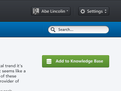
Add To Knowledge
Bady
Available for work
Follow
Following
Like
Get in touch
#F2F4F7
#2E3034
#0160A1
#629937
#A8AEA7
#38A1A2
#6E7D87
Download color palette
Rebound of
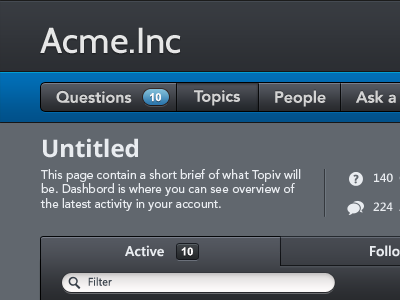
Dashboard Page ⨰
By
Bady
about
app
black
button
dark
dashboard
design
designer
gui
header
home
information architecture
interface
minimal
minimalist
profile
question
search
separator
setting
tag
ui
usability
ux
web
View all tags
Posted on Dec 18, 2011
11,083
17
74
6
View feedback
Bady
Get in touch
More by Bady
View profile
Previous
Next
Loading…
Loading…
Loading…