Photoshopscreensnapz001

11 Responses

  1. Pro Veerle Pieters Veerle Pieters

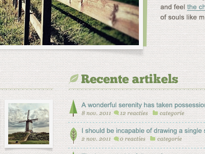
    Theme design in process for Fork CMS.

    likes

    over 1 year ago

  2. Thijs Wostyn Thijs Wostyn

    Love it!

    Only the green rectangle behind the picture seems odd. But maybe it is because it's not the full website we see ...

    over 1 year ago

  3. Jeremy Swinnen Jeremy Swinnen

    Dig the little icons!

    likes

    over 1 year ago

  4. Pro Cédric Charles Cédric Charles

    Very Nice :) !
    What is the font you use for "Recente artikels" ?

    Textures are great !

    over 1 year ago

  5. Pro Johan Ronsse Johan Ronsse

    over 1 year ago

  6. Pro Veerle Pieters Veerle Pieters

    @Thijs Wostyn thanks! Yes it's part of the frame styling of the photo.

    @Jeremy Swinnen thanks!

    @Cédric Charles thanks! It's indeed Chunk Five (see tag) a font from The League of Moveable Type ;)

    over 1 year ago

  7. Stijn Anthoni Stijn Anthoni

    It's nitpicking but I would remove the icon in front of "Recente Artikels". A bit "too many icons" now.

    over 1 year ago

  8. Pieter Beulque Pieter Beulque

    Not digging the Helvetica under Recente Artikels, seems like it's breaking the whole atmosphere.

    over 1 year ago

  9. Pro Veerle Pieters Veerle Pieters

    @Stijn I think it's just because you only see a fraction I'm afraid. You can't judge the total picture in just 400x300 px fragment.

    @Pieter I don't agree with you, I like the contrast between the 2 typefaces. Maybe you feel this way because of the same reason, that you only see a small fragment and so this is kinda misleading.

    over 1 year ago

  10. Trevor Gerzen Trevor Gerzen

    When do you think this is going to be available?

    over 1 year ago

  11. Pro Veerle Pieters Veerle Pieters

    @Trevor Gerzen I don't have the exact date, but I suppose soon.

    likes

    over 1 year ago

keyboard shortcuts: previous shot next shot L or F like