Great stuff as always. Just a small detail which drives me crazy: the sign up input, the line on top of it and the left gallery image seem to be not left aligned. On the right side it fits perfectly.
And I love the low poly style on that pyramids! Great style and texture!
Im not only sure if the Live Chat button needs that much space, while basket is pretty tightened from both sides. :) And maybe the search could pop up more from the menu, its lost.
34 Responses (page 1 of 2)
Pro
Rally Interactive (via Ben...
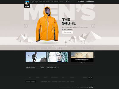
See attached screenshot for larger version....
over 1 year ago
Pro
Zane David
Great work guys!
over 1 year ago
Pro
Avinash Tripathi
nice :)
over 1 year ago
Pro
Joel Beukelman
love the shelf/div effect...working nice visually.
over 1 year ago
Pro
Lukas Majzlan
Yes! That's nice!
over 1 year ago
Pro
Hugo Loning
Dope
over 1 year ago
Future awards :)
over 1 year ago
Pro
Mani
nice job man :)
over 1 year ago
Pro
Nemanja Jovanovic aka Frac...
looks top notch!
over 1 year ago
Pro
Stefan Poulos
Love
over 1 year ago
You do good work, man.
over 1 year ago
Pro
Kreativa Studio
Awesome web!
over 1 year ago
spot on
over 1 year ago
Pro
Matthew Sanders
Nice stuff
over 1 year ago
Pro
Mark Bauer
This is perfect. Amazing design!
over 1 year ago
Pro
Mario Azzi
Best designer around!
over 1 year ago
Pro
Kelli Kreighbaum
Awesome! Diggin the depth it's got.
over 1 year ago
Pro
Moritz v. V.
Great stuff as always. Just a small detail which drives me crazy: the sign up input, the line on top of it and the left gallery image seem to be not left aligned. On the right side it fits perfectly.
And I love the low poly style on that pyramids! Great style and texture!
over 1 year ago
I'm itching to click every button on this page... well done.
Is this part of the previous concepts that were rejected by the client? Hopefully not.
over 1 year ago
Rad...as usual.
over 1 year ago
Pro
Frantisek Kusovsky
Big fan of this style! Its pure awesomeness.
Im not only sure if the Live Chat button needs that much space, while basket is pretty tightened from both sides. :) And maybe the search could pop up more from the menu, its lost.
over 1 year ago
NICE!
over 1 year ago
Pro
Dann Petty
EPIC.
over 1 year ago
This is gorgeous and perfectly balanced. Love the extra bold face of the category and title text.
Did you guys have any second thoughts about using the same slideshow arrows here as you did on your site?
over 1 year ago
Pro
Stephen Moorehead
Great work and nice layout!
over 1 year ago