Find designers
Designer search
Quickly find your next designer
Post a job
The #1 job board for design talent
Inspiration
Courses
UX Diploma
Learn UX design from scratch in 6 months
UI Certificate
12-week UI skill building for designers
Live interactive workshops
with design professionals
Jobs
Go Pro
Log in
Dribbble: the community for graphic design
Log in
Sign up
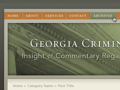
Blogs for lawyers
Meagan Fisher Couldwell
Available for work
Follow
Following
Like
Get in touch
#61664F
#494C3A
#CECCBE
#7B845F
#8E9069
#B47638
Download color palette
ampersand
avenir
georgia
green
orange
requiem
View all tags
Posted on Jul 14, 2010
6,455
6
42
14
View feedback
Meagan Fisher Couldwell
Freelance web designer and developer
Get in touch
More by Meagan Fisher Couldwell
View profile
Previous
Next
Loading…
Loading…