Gallery, Rooms & Amenities

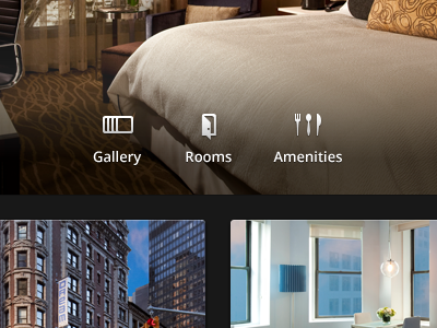
This UI is proving to be a little bitch to me. Can't seem to get it right. However, just showing the icons I did for it. Pretty chuffed with how they came out!
This UI is proving to be a little bitch to me. Can't seem to get it right. However, just showing the icons I did for it. Pretty chuffed with how they came out!


