Find designers
Designer search
Quickly find your next designer
Post a job
The #1 job board for design talent
Inspiration
Courses
UX Diploma
Learn UX design from scratch in 6 months
UI Certificate
12-week UI skill building for designers
Live interactive workshops
with design professionals
Jobs
Go Pro
Log in
Dribbble: the community for graphic design
Log in
Sign up
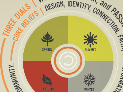
info chart
Jared Erickson
Available for work
Follow
Following
Like
Get in touch
#DFDCC7
#C3B445
#A4A495
#B84732
#3A3A3B
#63635F
#E1B789
Download color palette
chart
info
seasons
View all tags
Posted on Dec 13, 2011
1,963
1
17
3
View feedback
Jared Erickson
Get in touch
More by Jared Erickson
View profile
Previous
Next
Loading…
Loading…
Loading…