I agree. There's something not quite right about the pin. Personally, I think it's got something to do with the fact that it looks hand-drawn, unlike the rest.
I would also consider adjusting the phrase at the very top; it could be considered to be a little patronising. Instead, it might be worth going with something like 'order confirmed' or 'order placed'.
5 Responses
Pro
Chad Bercea
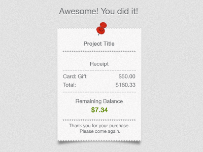
Here's a quick lil shot of an idea I mocked up for the closure step of the payment process. Just playing around flushing out ideas.
6 months ago
Pro
Noel Tock
Looks nice, might be cool to have the same color pin as "response type" (i.e. green = good), and getting a drop shadow on it (similar to the receipt).
6 months ago
I agree. There's something not quite right about the pin. Personally, I think it's got something to do with the fact that it looks hand-drawn, unlike the rest.
I would also consider adjusting the phrase at the very top; it could be considered to be a little patronising. Instead, it might be worth going with something like 'order confirmed' or 'order placed'.
6 months ago
Pro
Chad Bercea
Guys, really. Thank you. Awesome thoughts. Let me hit you with a rebound later. Thanks for helping me lock this down!
6 months ago
Rebound
Order Confirmation
by Chad Bercea
Here is my rebound after some great feedback. Updated the push-pin illustration and cleaned up the information presented.
6 months ago