Be true | Smoothie

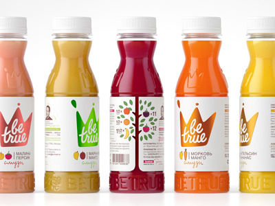
The main message of the brand — to be honest and real — is embodied in the new symbol — the crown, which is formed from a splash smoothies. The logo embossed foil on textured paper, underscoring the privilege brand. Occurring edge labels form a fruit tree, an important complementary design infographics.
Designed in StudioIN Packaging Ideas / Moscow


