New HeySport Logo

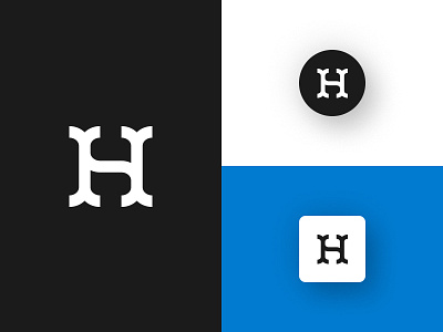
Updated the HeySport logo so that the 'H' is more prominent and the 'S' is subtle. See it?
I also wanted something that could look good on a hat but also something that would scale down well for things like social avatars.

Updated the HeySport logo so that the 'H' is more prominent and the 'S' is subtle. See it?
I also wanted something that could look good on a hat but also something that would scale down well for things like social avatars.


