Gteehan_profile

Show+Tell

Screen_shot_2011-12-07_at_6

3 Responses

  1. Pro Gteehan_profile Geoff Teehan

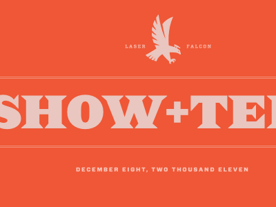
    A quick and dirty keynote title slide for an internal presentation to show the rest of the company (outside my team) what we've been working on. I haven't dribbbled in ages but liked how these fonts compliment each-other. Also, the falcon needs replacing - I just stole it from Google Images.

    6 months ago

  2. Pro Drew_300x300 Drew Matthews

    i like it, i feel like its missing the opportunity to use some kind of banner ornament. but in a non curvy and more angelerly way (is that even a word) maybe I'm just into banners right now... :\

    6 months ago

  3. Image2_normal Sacha Sayan

    I agree with you, Drew. I think the lines could be much more ornamental to match the text. That isn't meant to be a strong critique -- it looks great as-is. But I do think it's an... agreeable piece of direction. Found myself nodding my head to it, at least.

    5 months ago

keyboard shortcuts: previous shot next shot L or F like