The Leg-Up Program monogram
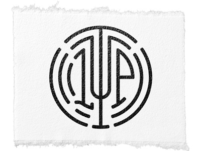
Conceived this one day while trying to come up with a new logo for The Leg-Up Program. It started with a big "L" which eventually became the "T" after I realized that I could have the "L" and "P" taking up similar area within the drawing. The "U" was a no-brainer given its symmetry and once I realized that the design is really just comprised of 4 concentric circles that are either deleted in certain areas or joined to other parts of itself or one of the other circles in other areas... the rest designed itself. I felt the dip at the bottom of the "L" was necessary. Lemme know what you think.


