


Icons WIP - 2

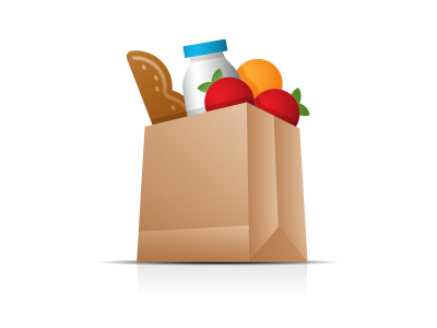
This icon concept is for the subject of food obviously. If the client approves these icons & we proceed, I'm thinking of changing that bread to lettuce. I think adding the green will work better than brown bread + brown bag. Thoughts?

This icon concept is for the subject of food obviously. If the client approves these icons & we proceed, I'm thinking of changing that bread to lettuce. I think adding the green will work better than brown bread + brown bag. Thoughts?


