Ai30th : Circles

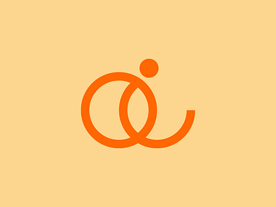
The second one was actually the result of me trying to construct one idea and happening across a slightly different one I liked. This one is me playing with circles instead of sharp edged shapes. An overlapping lowercase a and i are created in this logo. I like to think of this one as a throwback, old-school Illustrator logo. Seems like something you’d see on a vintage floppy disk – at least to me anyway.


