Find designers
Designer search
Quickly find your next designer
Post a job
The #1 job board for design talent
Inspiration
Courses
UX Diploma
Learn UX design from scratch in 6 months
UI Certificate
12-week UI skill building for designers
Live interactive workshops
with design professionals
Jobs
Go Pro
Log in
Dribbble: the community for graphic design
Log in
Sign up
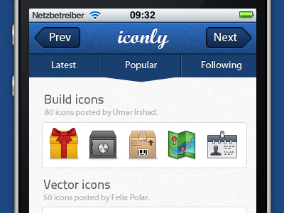
Iconlyapp
Daors Reka
Follow
Following
Like
#F5F5F5
#1D4478
#15161A
#ACAAA7
#9A8A56
#3570C0
Download color palette
that's my first app design.. so, what do you think?
app
icon
icons
iphone
iphone app
View all tags
Posted on Dec 4, 2011
1,838
7
90
17
View feedback
Daors Reka
More by Daors Reka
View profile
Previous
Next
Loading…