Smash Design Wordmark

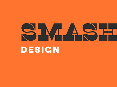
A reverse contrast typeface is where the horizontal strokes are thicker than the vertical strokes—the opposite of 95% of typefaces. To further accentuate this is the backwards strokes of the `M` and `A`.
This 19th-century idea is still a little punk rock today. And should work pretty well as a mark for my brother-in-law’s new (mildly punk rock) architecture identity.


