Find designers
Designer search
Quickly find your next designer
Post a job
The #1 job board for design talent
Inspiration
Courses
UX Diploma
Learn UX design from scratch in 6 months
UI Certificate
12-week UI skill building for designers
Live interactive workshops
with design professionals
Jobs
Go Pro
Log in
Dribbble: the community for graphic design
Advance your career with a Professional Diploma in UX Design
Learn more
Log in
Sign up
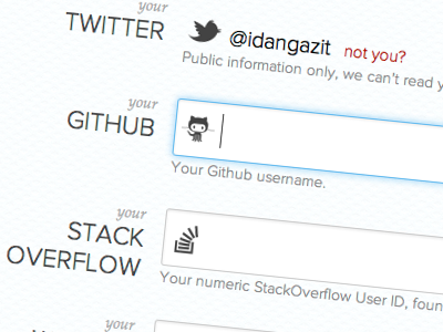
Social Data Forms
Idan Gazit
Follow
Following
Like
#FAFDFD
#A8D2EB
#CCBDB2
#555455
#A19EA1
#94736C
#6CADD5
Download color palette
forms
proximanova
social
View all tags
Posted on Nov 29, 2011
2,267
8
58
5
View feedback
Idan Gazit
More by Idan Gazit
View profile
Previous
Next
Loading…