Find designers
Designer search
Quickly find your next designer
Post a job
The #1 job board for design talent
Inspiration
Courses
UX Diploma
Learn UX design from scratch in 6 months
UI Certificate
12-week UI skill building for designers
Live interactive workshops
with design professionals
Jobs
Go Pro
Log in
Dribbble: the community for graphic design
Log in
Sign up
WP WIP
Orman Clark
Follow
Following
Like
#4C4B4F
#D0AB6A
#F8F5F6
#B8504D
#504227
#39ABDC
#B3915A
#C3ACA2
Download color palette
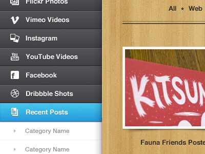
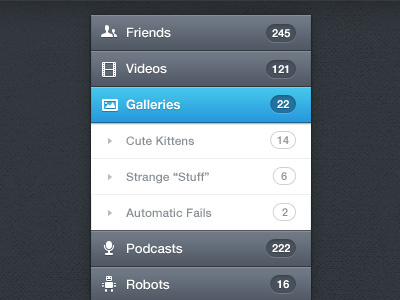
Just a lil' something..
Rebound of
Menu
By
Orman Clark
iconsweets2
menu
wood
View all tags
Posted on Nov 29, 2011
16,261
56
458
24
View feedback
Orman Clark
LemonSqueezy․com + PremiumPixels․com + Dunked․com ✌️
More by Orman Clark
View profile
Previous
Next
Loading…