Find designers
Designer search
Quickly find your next designer
Post a job
The #1 job board for design talent
Inspiration
Courses
UX Diploma
Learn UX design from scratch in 6 months
UI Certificate
12-week UI skill building for designers
Live interactive workshops
with design professionals
Jobs
Go Pro
Log in
Dribbble: the community for graphic design
Advance your career with a Professional Diploma in UX Design
Learn more
Log in
Sign up
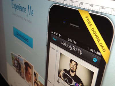
Landing page for iPhone app!
Eric Hoffman
Available for work
Follow
Following
Like
Get in touch
#1D1615
#656663
#969B98
#47433F
#E7E7E2
#D3BE53
#CCC0AF
Download color palette
Something I whipped up for my client this evening. Check the
full size
as my 400x300 is garbage :)
app
download
ios
iphone
landing
mobile
site
splash
web
View all tags
Posted on Nov 27, 2011
12,686
46
221
22
View feedback
Eric Hoffman
Founder Reform Collective, Over 13 years of experience
Get in touch
More by Eric Hoffman
View profile
Previous
Next
Loading…
Loading…
Loading…