Find designers
Designer search
Quickly find your next designer
Post a job
The #1 job board for design talent
Inspiration
Courses
UX Diploma
Learn UX design from scratch in 6 months
UI Certificate
12-week UI skill building for designers
Live interactive workshops
with design professionals
Jobs
Go Pro
Log in
Dribbble: the community for graphic design
Log in
Sign up
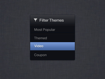
Filter Themes
Onur Oztaskiran
Available for work
Follow
Following
Like
Get in touch
#3A3B41
#2D2E34
#6D8DC9
#4F6FA8
#5D5E60
#BEC0C4
#3F5682
Download color palette
filter
icon
View all tags
Posted on Nov 25, 2011
3,690
2
43
6
View feedback
Onur Oztaskiran
Multi-disciplinary Senior Designer. Celebrating 20 years!
Get in touch
More by Onur Oztaskiran
View profile
Previous
Next
Loading…
Loading…
Loading…