Developer Dashboard

Screen_shot_2011-11-25_at_9

31 Responses (page 1 of 2)

  1. Pro Tyler Galpin Tyler Galpin

    Because why can't developers have nice-looking dashboards too?

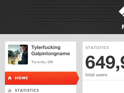
    Some stuff I've been working on lately for FTW. I revamped the identity and am slowly but surely building out the web and iPhone interfaces. Big things to come.

    Trying to dribbble more of my work, but most of it is under NDA.

    over 1 year ago

  2. Pro Prekesh Chavda Prekesh Chavda

    Galpinlongpenis

    likes

    over 1 year ago

  3. Dan Eden Dan Eden

    Futuralicious.

    likes

    over 1 year ago

  4. Pro Daniel Klopper Daniel Klopper

    this looks sexy!

    likes

    over 1 year ago

  5. Pro Adrian Mato Adrian Mato

    Loving that red / orange.

    likes

    over 1 year ago

  6. Pro Tom Creighton Tom Creighton

    Ha, I do the same thing. "Oh no, this space could potentially have a really long name in it! Mr. Superlongfirstname Lastnameslongersson, hello!"

    likes

    over 1 year ago

  7. Pro James ✌ James ✌

    Only comment i'd make is more padding on the text to the right? Apart from that, sheer sex in 400x300.

    likes

    over 1 year ago

  8. Pro Tyler Galpin Tyler Galpin

    Thanks guys!

    @Dan: My favourite :)

    @Tom: Long hours spent inside a PSD means I need to entertain myself in little petty ways.

    @James: It's 10px and we are fitting a lot in there, but will definitely take another look at it. Thanks bud.

    over 1 year ago

  9. Pro Jake Rocheleau Jake Rocheleau

    nice big numbers that's sure to draw attention

    likes

    over 1 year ago

  10. Pro Anders Drage Anders Drage

    I... need.... more.....

    likes

    over 1 year ago

  11. Pro Tyler Reckart Tyler Reckart

    Very smooth. Textures are brilliant.

    likes

    over 1 year ago

  12. Pro Justin Elson Justin Elson

    Good textures as always.

    likes

    over 1 year ago

  13. Joe Prince Joe Prince

    That must have sucked in 1st grade when you had to write your name in cursive.

    likes

    over 1 year ago

  14. Pro Matt Kump? Matt Kump?

    Yep, that's a graphics design

    likes

    over 1 year ago

  15. Pro Gert Tzafa Gert Tzafa

    Nice colors!!

    over 1 year ago

  16. Collin Henderson Collin Henderson

    Tyler Galpin's Textures = Sextures

    likes

    over 1 year ago

  17. Carl Wood Carl Wood

    Really clean - love the textures.

    likes

    over 1 year ago

  18. Ric Furness Ric Furness

    Slick man.

    likes

    over 1 year ago

  19. Pro Sahand Nayebaziz Sahand Nayebaziz

    love the selection on home, it's beautiful.

    do you make your godly textures with noise layers or magical speckle brushes?

    likes

    over 1 year ago

  20. Alex Saunders Alex Saunders

    Gorgeous.

    likes

    over 1 year ago

  21. Pro Maxime De Greve ✈ Maxime De Greve ✈

    boom shakalaka , T.G. Back in the house!

    likes

    over 1 year ago

  22. Richard Cook Richard Cook

    This is brilliant. I love the top area too - I do agree with James however, with the padding.

    likes

    over 1 year ago

  23. Pro Tyler Galpin Tyler Galpin

    Thanka everyone. Been so long since I have continually dribbbled, will be nice to get active in the community again.

    @Sahand: For the noisy-looking shadows I use sometimes, I replicate the layer that needs the shadow, apply a dropshadow, make sure fill is set to 0%, convert to smart object, and then apply a heavy noise. Then I tone it down using opacity.

    For my regular textures, I use a combination of grunge brushes and textures I have taken photos of and then heavily modified.

    likes

    over 1 year ago

  24. ♜ Monsieur Didi ♜ ♜ Monsieur Didi ♜

    this is looking great man keep it up :)

    likes

    over 1 year ago

  25. Richard Cook Richard Cook

    P.S You seriously need to dribbble more! ;)

    likes

    over 1 year ago

keyboard shortcuts: previous shot next shot L or F like