Norm logo

Ski Slider

Slider

21 Responses

  1. Pro Norm logo Norm

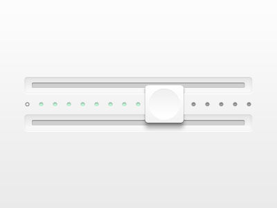
    This is a more out there piece from my next user interface set, yeah I know its all pointless I only need one runner! just wanted to try something new.

    6 months ago

  2. Pro Set Alexandre Deschamps

    Awesome!

    6 months ago

  3. Pro Img_8025 Viktor Engborg

    This is all very confusing.

    6 months ago

  4. Pro Norm logo Norm

    @victor its just a slider but on two rails with the display in between the sliders. But I get what your saying but that's kinda the whole point if my goal was making it simple I would have uploaded something you'd seen a million times before.

    6 months ago

  5. Ernesto Matias Gallipoli

    i think it might look better/less confusing if u just keep one rail, the knob on top of that, and the light indicators on the bottom or top, but just one rail, cause it doesnt make too much sense having 2 rails for 1 slider, it would make more sense if the knob was taller, like double of its actual height.
    the shading looks very cute btw :)

    6 months ago

  6. Pro Norm logo Norm

    I don't think anyone understands my idea. Just experimenting really get a bit sick of doing the same all stuff!

    likes

    6 months ago

  7. Me Gilberto Lenzi

    I really like this,it's something completely different from what you can see out there.
    Also I believe that sometimes it's good to "hack" the standard UI element and think outside of the box....
    Just with proper testing you can see what's performing better.

    Would be even nicer if you try to make more obvious the link between the scroller and the two rails...
    (perhaps some tiny metal elements?)

    likes

    6 months ago

  8. 41377_100000515127332_2330_n Lennart Breel

    If I had the skills or time I would rebound this with an even crazier UI element. This is the beginning of a new movement; UI art :) Not meant for UX based goals!

    likes

    6 months ago

  9. Pro 404269_3172733992974_1104265881_33245634_1797349582_n Zane David

    Norm, I think it looks kick ass! Props for trying something new!

    6 months ago

  10. Pro Norm logo Norm

    @Gilberto and @Lennart Finally someone gets it!! Sometimes its cool to just design and see what happens!

    6 months ago

  11. 41377_100000515127332_2330_n Lennart Breel

    I would enjoy a poster with some crazy UI experiments, and who knows, maybe even some great UX ideas spawn from those experiments!

    6 months ago

  12. Pro 80x80 Diego Monzon

    Very nice, I love "different"

    likes

    6 months ago

  13. Pro Transparant_bubble_avatar Yummygum

    The look and details are awesome. I think I understand what some are saying here. It's cool to have two 'slots'/rails but if the knob isn't attached to those two slots/rails (or seemingly aren't sliding in the slots). Making the white square knob just a bit bigger would make it seem like it's hooked onto the rails I think. I do love you're out the box thinking btw!

    likes

    6 months ago

  14. Pro Norm logo Norm

    @Yummygum the rails are just slits cut into the background the sliding part is meant to be fixed the the center piece, the top and bottom of the sliding button overlap the center part and meet again behind. Its a bit out there I know but think of a threaded wooden bead on a poll thats the idea behind how the slider moves.

    6 months ago

  15. Pro Img_1004_colorista_profilbild Ines Gamler

    pretty cool! great work.

    6 months ago

  16. Pro Transparant_bubble_avatar Yummygum

    @Norm hmm okay

    6 months ago

  17. Pro Colourtriangleportrait (1 of 1) Olga Epikhina

    sweet!

    6 months ago

  18. Pro Me Jamie Hunter

    Love the look of this. As a few people have said, have you tried scaling the height of the button so it covers both slits (maybe even goes beyond them a little)? If this were a physical product, that's what I would expect. Really nice idea though!

    6 months ago

  19. Pro Av Jeremy Sallée ✦✦✦

    so cleannn! Like everything you do! I love your treatment on such white surfaces!

    likes

    6 months ago

  20. Pro Brianwhite Brian White

    looks nice!

    6 months ago

  21. Pro Lee-fuller Lee Fuller

    I like the fact that this is against the norm... beautiful gradients, clean lines, love the green you've used too...

    about 1 month ago

keyboard shortcuts: previous shot next shot L or F like