Home is where the heart is.

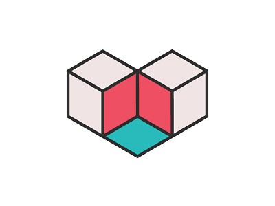
An unused logo symbol concept for a high-end residential architecture company. The idea was to play off of the saying "Home is where the heart is."
I used two cubes that come together to create an illusion in the middle. Some see an empty space, others see a third cube.


