Find designers
Designer search
Quickly find your next designer
Post a job
The #1 job board for design talent
Inspiration
Courses
UX Diploma
Learn UX design from scratch in 6 months
UI Certificate
12-week UI skill building for designers
Live interactive workshops
with design professionals
Jobs
Go Pro
Log in
Dribbble: the community for graphic design
Log in
Sign up
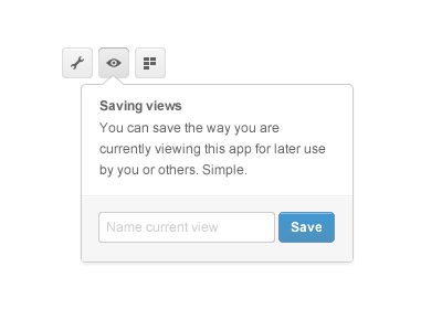
Save it up
Pete Lacey
for
Podio
Follow
Following
Like
#FDFDFD
#9E9E9E
#A7CCE5
#4996C9
#6A6A6A
Download color palette
Designin'
fireworks
interface
podio
prototype
ui
View all tags
Posted on Nov 23, 2011
3,416
13
80
10
View feedback
Podio
More by Podio
View profile
Previous
Next
Loading…