Find designers
Designer search
Quickly find your next designer
Post a job
The #1 job board for design talent
Inspiration
Courses
UX Diploma
Learn UX design from scratch in 6 months
UI Certificate
12-week UI skill building for designers
Live interactive workshops
with design professionals
Jobs
Go Pro
Log in
Dribbble: the community for graphic design
Log in
Sign up
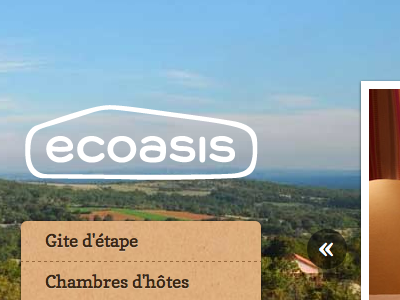
Final version on the website
Thibaut Sailly
Follow
Following
Like
#92BCD9
#CECECC
#DBAB79
#463B22
#555E50
#828B8D
#998C67
Download color palette
A little more geometry in the final version helped the logo to be readable in different sizes.
Posted on Nov 22, 2011
249
0
4
0
View feedback
Thibaut Sailly
More by Thibaut Sailly
View profile
Previous
Next
Loading…