Daily UI #21 – Monitoring Dashboard


021/100 Daily UI Challenge: Monitoring Dashboard
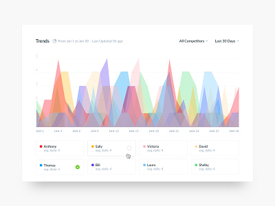
Trying to figure out the best way to display chunks of data over time. This dashboard shows the changes in values for different entities (people like "Anthony," "Sally," etc) on a daily basis.
With 30 points needing to be shown in such a small amount of space, I think that using filled shapes that overlay on one another helps visualize the changes and differences a little better than just unfilled lines.
If you have any suggestions or inspiration, I'd love some feedback for how to better present data like this!
See attached for 2x.
Assets Used
Font: Lato


