Responsive table experiment

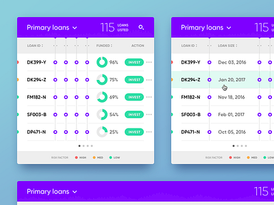

I'm currently working on a project for an online student loans service. One of the challenges was to discover the right approach for presenting multi-column responsive tables throughout different screen sizes. This experiment is a part of my research on the subject. My main goal was to find a solution that is both user and development friendly. This ended up as the best option of all. In narrow viewports selected columns are hidden, users are able to unhide each column with tap/click in order to read the content.


