Uploading to Pattern Tap

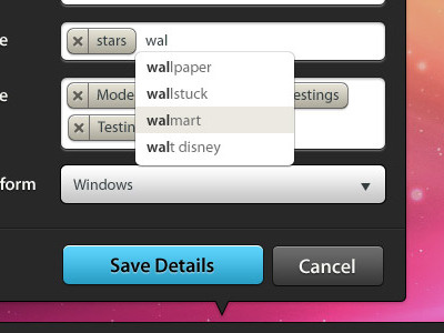

I made a few tweaks to what Haziq had started to keep in line with a few other style choices I'd made for other areas of the site. I'm loving working with Haziq (16 yrs old!!!)
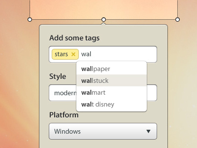
I made a few tweaks to what Haziq had started to keep in line with a few other style choices I'd made for other areas of the site. I'm loving working with Haziq (16 yrs old!!!)


