Find designers
Designer search
Quickly find your next designer
Post a job
The #1 job board for design talent
Inspiration
Courses
UX Diploma
Learn UX design from scratch in 6 months
UI Certificate
12-week UI skill building for designers
Live interactive workshops
with design professionals
Jobs
Go Pro
Log in
Dribbble: the community for graphic design
Log in
Sign up
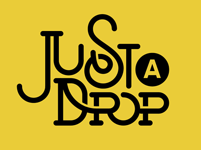
Just A Drop
Michael Spitz
Available for work
Follow
Following
Like
Get in touch
#EBCD38
#020200
#CEB431
#FFEC41
#433B10
#A69127
#615517
#8A7920
Download color palette
Final stretch...
Rebound of
Drop
By
Michael Spitz
a train
custom type
lettering
letterpress
ligature
michaelspitz
michael spitz
mta
nyc
poster
quote
subway
type
typography
View all tags
Posted on Nov 17, 2011
10,061
27
267
32
View feedback
Michael Spitz
Welcome to my design portfolio on Dribbble
Get in touch
More by Michael Spitz
View profile
Previous
Next
Loading…
Loading…
Loading…