Find designers
Designer search
Quickly find your next designer
Post a job
The #1 job board for design talent
Inspiration
Courses
UX Diploma
Learn UX design from scratch in 6 months
UI Certificate
12-week UI skill building for designers
Live interactive workshops
with design professionals
Jobs
Go Pro
Log in
Dribbble: the community for graphic design
Advance your career with a Professional Diploma in UX Design
Learn more
Log in
Sign up
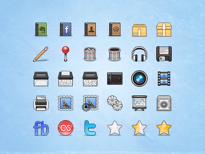
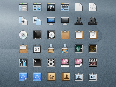
Icon Set
coconut
Follow
Following
Like
#ADD5F5
#5FA6DA
#56514F
#B1AEAD
#211F1F
#D9B265
#915F6B
Download color palette
I'm at 80 icons now, here are a few of them. Critique and feedback are welcome :)
Rebound of
Prime
By
coconut
icons
stock icon set
View all tags
Posted on Jul 2, 2010
4,053
5
48
12
View feedback
coconut
More by coconut
View profile
Previous
Next
Loading…