Octahedron Logo

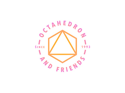
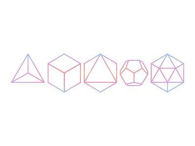
Another day, another platonic solid logo! The third platonic solid is an octahedron. I originally had rendered it a lot lighter, but found that the style I settled on was a better fit for a heavier font weight. Just like the others in my platonic logo series, it features it's own unique soft gradient. This one's gradient reminds me a lot of sorbet 🍦😋
Fonts used: Avenir Next, Avinir Next Condensed
Tools used: Affinity Designer, macOS