EVO Home Concept


Hey guys! Happy 2017 to all ya!
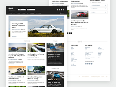
I designed this little concept for EVO Magazine last night, I felt inspired to do some polishing on their home page. I'm a big fan of their publication and their content and I just tweaked some elements, tried out different styles and had a bit of fun.
---
Overall layout is not different at all, I just played with visuals, I don't have any data nor insights in order to change things radically. Hence the reason why I kept the order of content as it is right now.
Color palette is in-line with what EVO uses right now and I thought it would be a bad move to change it.
Yes, I removed all GoogleAds purely for the sake of concept. However, I don't see any issues integrating ads on this design as well, since the layout really works nicely. I believe the overall content feels a bit more modern and has a cleaner look with the concept I did.
All media assets and text belong to EVO, I used them to get the closest as I could to the real deal.
---
Anyways, this exploration is just for the sake of having fun and trying out different things. You can check the full page here.
Cheers! 😄


